
Branding and visual identity for a gritty, no-nonsense Weatherford spin-off company focused on oil and gas exploration.
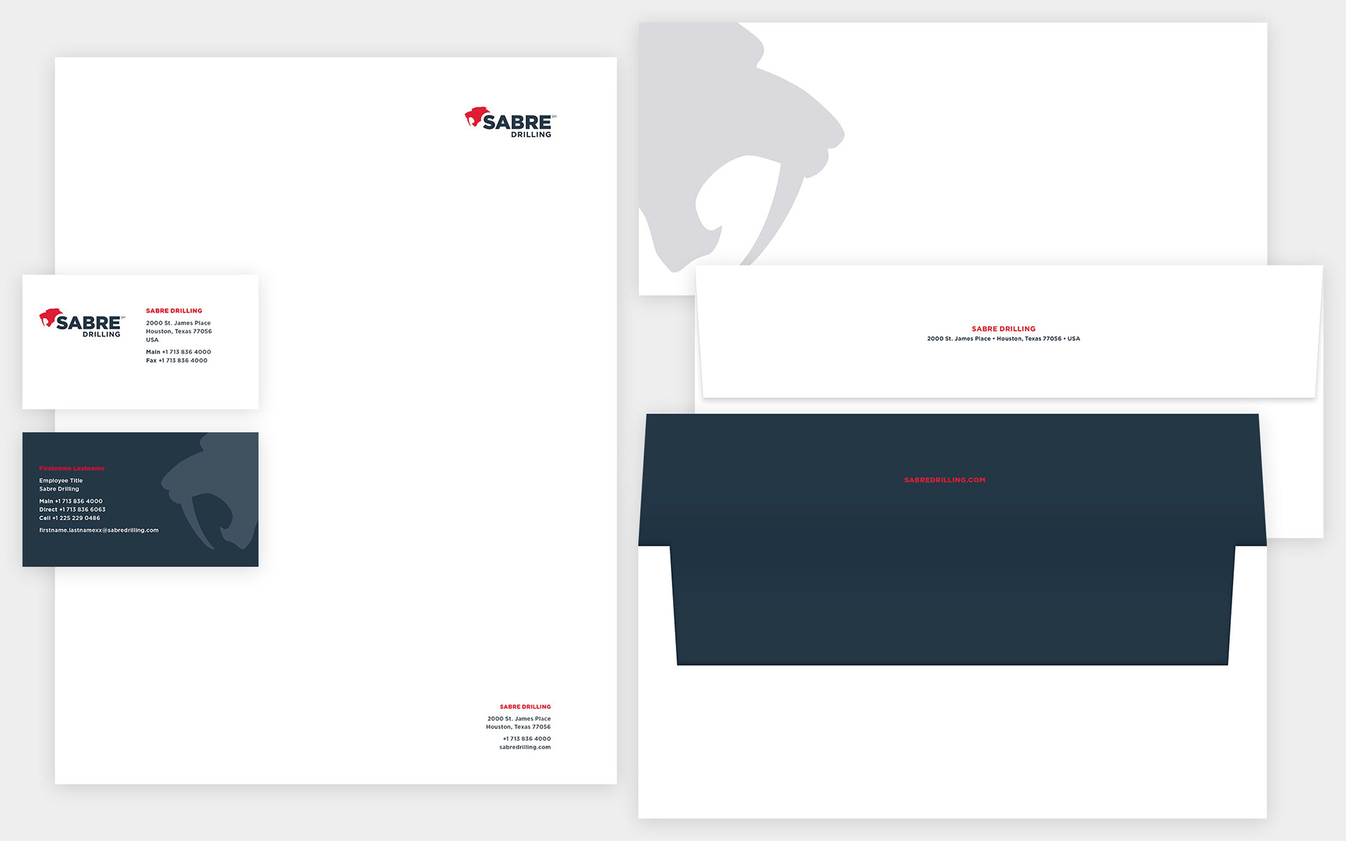
A Symbol of Strength and Experience
The saber-toothed cat's strength and agility are mirrored in Sabre Drilling's logo, symbolizing the expertise and experience that set them apart from competitors.

Stationery
A stationery system designed to facilitate corporate communications with partners, vendors, and clients. The suite of correspondence materials includes letterhead, envelopes, business cards, and email signatures.
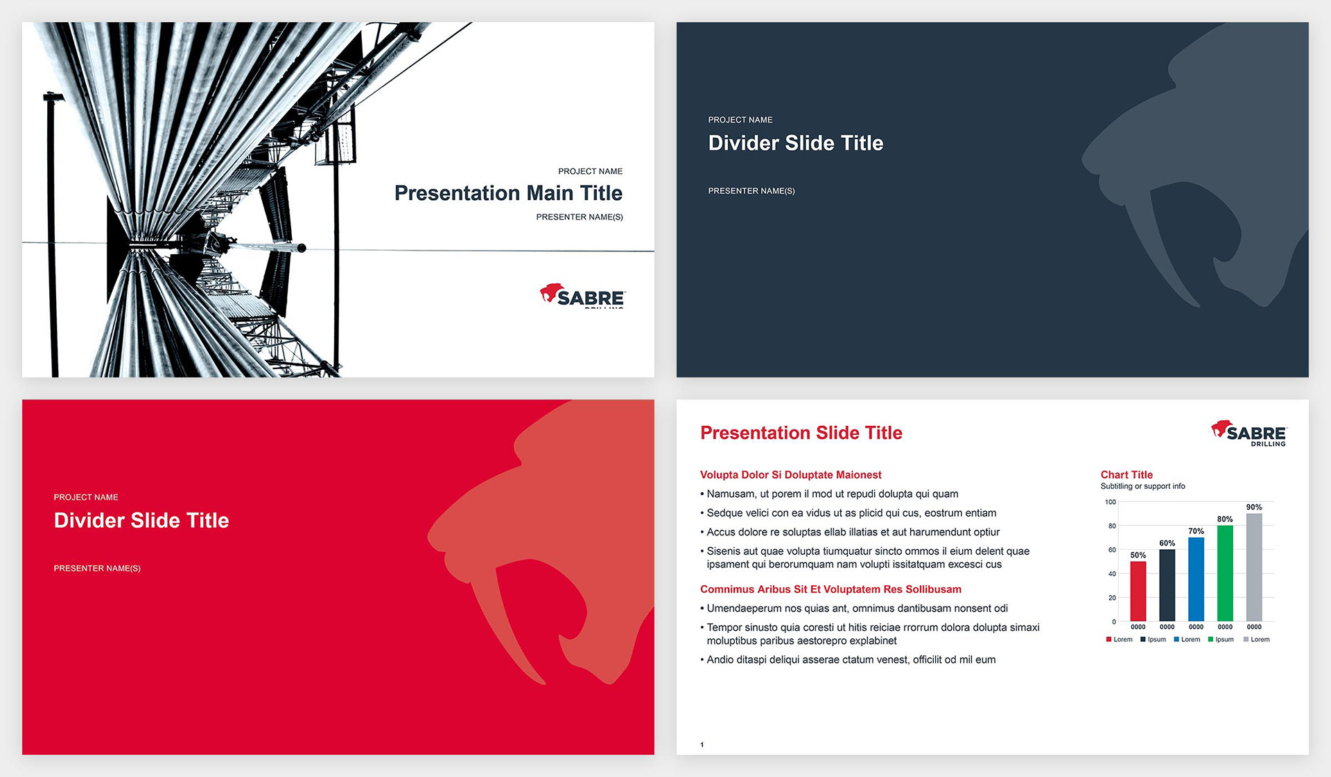
Showcasing Capabilities with Tailored Presentations
Tailored presentations on capabilities and assets were developed for in-person meetings and event engagement.
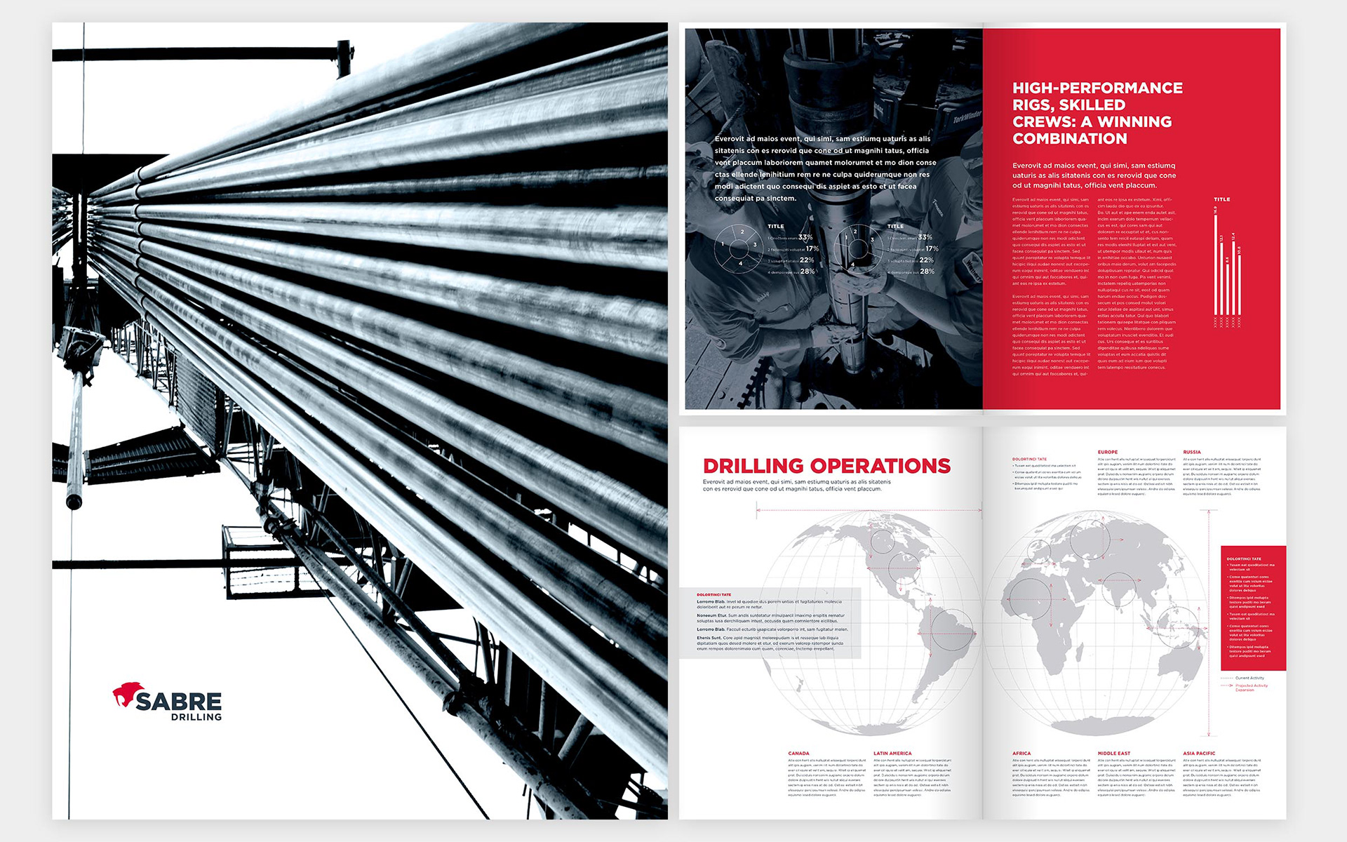
Brochure
Created a brochure to highlight the newly formed company's industry expertise and areas of operation.
Web Presence for the Industry & Investors
Established the company's web presence, showcasing industry expertise and providing investor information.
Project work created while employed at Savage Brands. My role in the project in bold.
Team members: brand strategist, creative director, art director, senior graphic designer, web development team, account manager
Team members: brand strategist, creative director, art director, senior graphic designer, web development team, account manager